
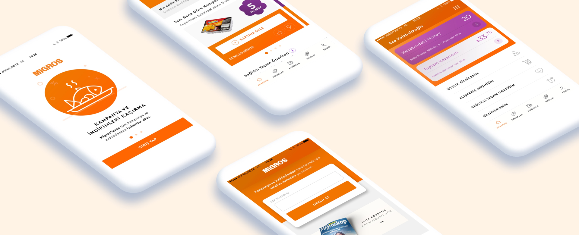
Migros, one of Turkey's largest brand in the grocery sector. More than 11 million people registered in the loyalty system. The mobile application of Migros also has over 5 million downloads. One of the biggest benefits of the mobile app is offering you special campaign based on your shopping habits and make you gain loyalty points called money*.
In this project I worked as an UX designer. I’ve conducted usability testing, prepared user flow, designed wireframe and prototyping.
The team is consisted of 1 UI designer.
Even if users downloaded the app, they either do not log in to the app or they delete the app. So we need to make them log in and use the app.
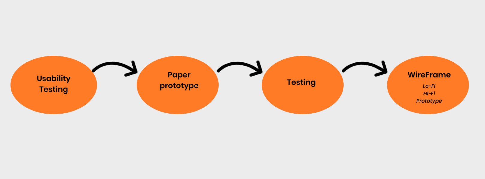
I have started to project by trying to understand why people can’t get the benefits of mobile application by conducting usability testings with the current app. I’ve recorded their actions and voices and make them say what they are thinking about the page or what they looking for.
At the end the of the testing I see that people can’t get the benefits because of 2 reasons:
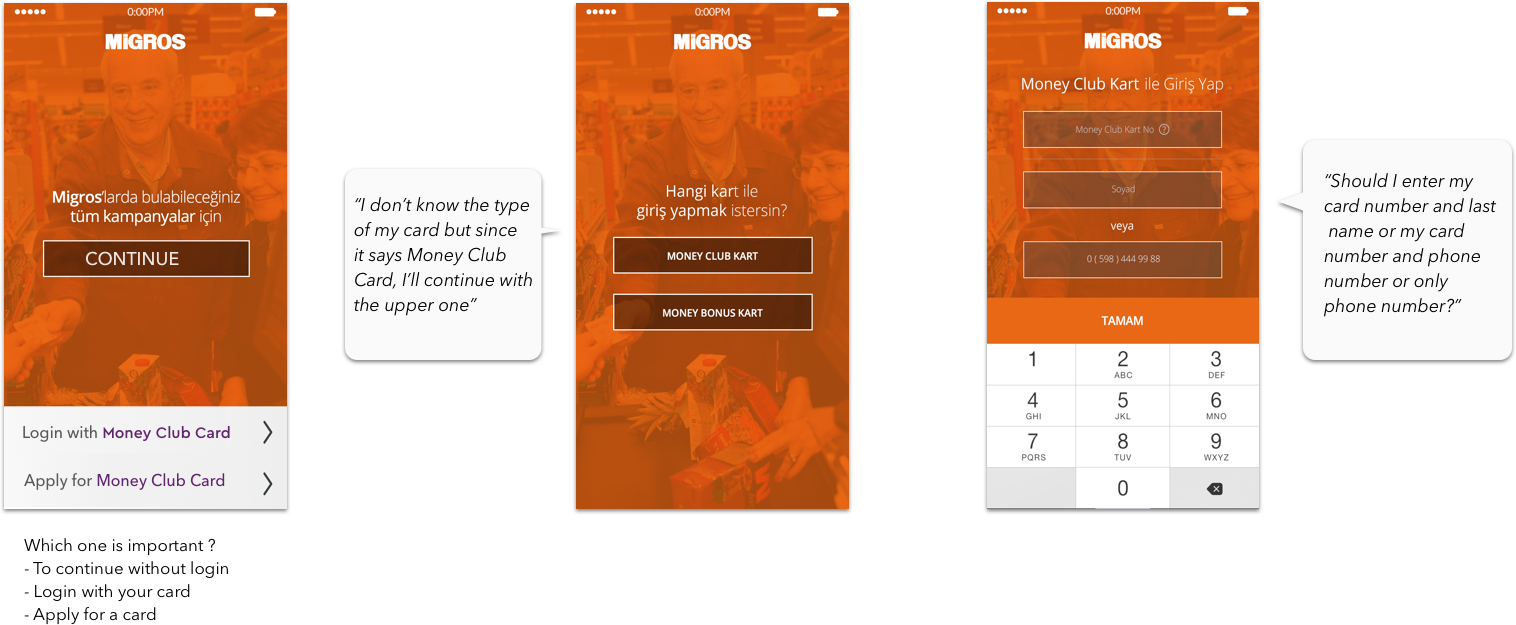
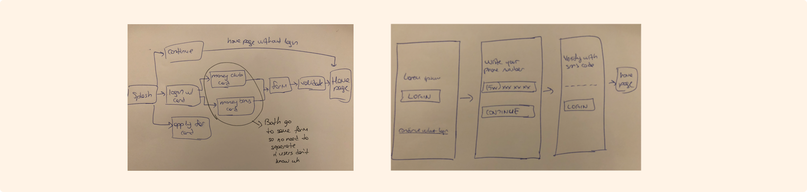
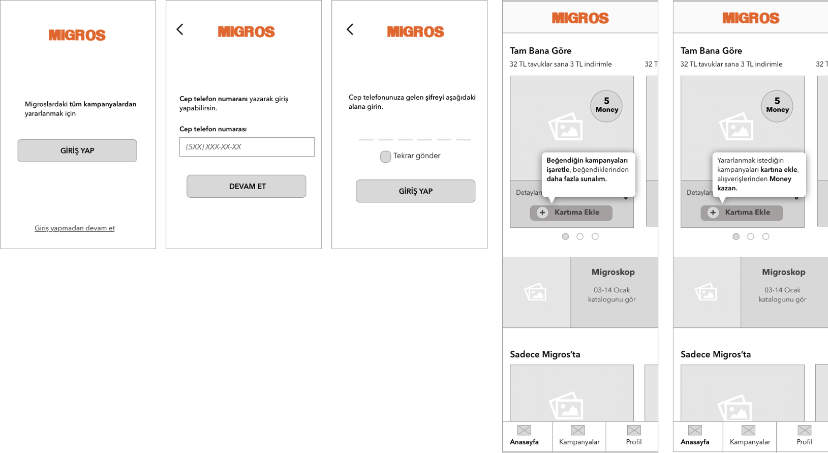
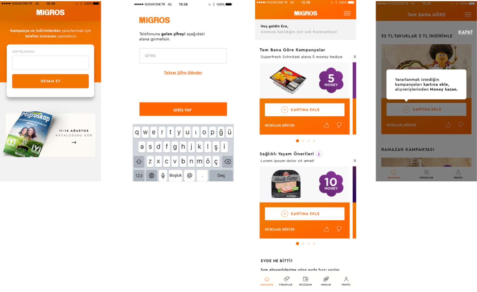
1- It is complicated to sign up to the app because there are 3 different types of signing up and the design is a bit confusing since there is nothing highlighted.
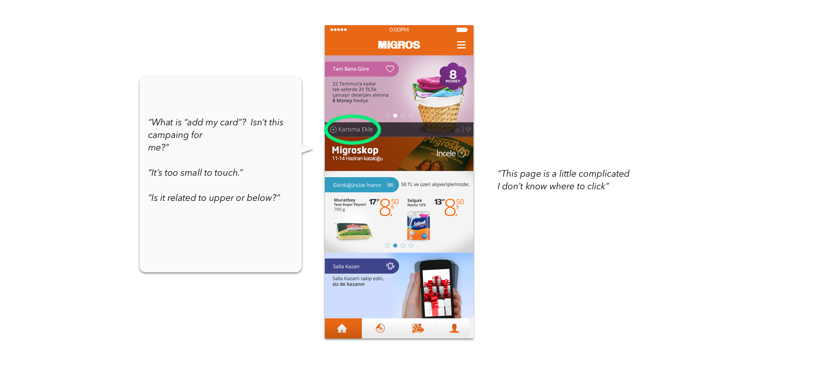
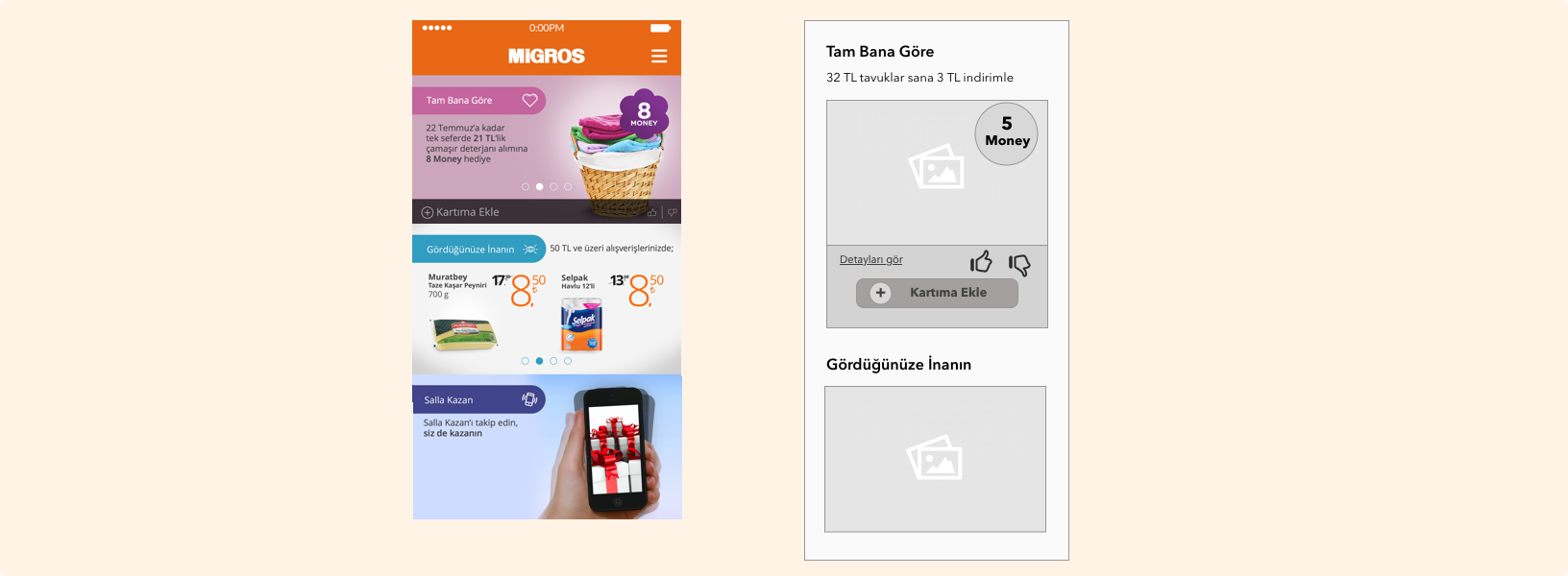
2- There is no explanation about how people can use the app. There are no tooltips or tutorials about the app so people basically don’t know what to do other than looking at the campaigns. There are some action buttons and pictures however they are not interacting with the users. Also buttons are so small and everything is so nested, it is frustrating to do something.
When I’ve ended usability testing, I realized that the main problem is onboarding. Users rather can't sign up or don't understand how to use the app. So I’ve started to work on sign up and tutorials.
First, the steps at the login process had to be edited. I’ve clarify the required datas and made the flow as simple as it can be. The user follow the same path, fill out the same informations even if the user has Money Club Card of Money Card. So I’ve eliminated this step with talking to developers. Also when we ask the users, we found out that users prefer logging in with their phone numbers rather than their card numbers. For entering with their card numbers; first they need to find their cards and check if they write it right. After discussing with product owners, I’ve also changed this as well.
After login process, I started the work on how to steps. I’ve added tutorials that explain the usage of the application for the first-time entrants by highlighting the important buttons of the app.

Another problem that I try to solve is white space usage and the sizes of the buttons and clickable areas. I’ve changed the button types and make them visible and easy to click.
For clickable areas, there are 2 types of campaigns in Migros: the type that users need to join to get the benefit, and the type which informs users about the discount. The former one has more information so this type has a detail screen, whereas the latter one only shows the discount and doesn’t need and have a detail screen. When this came out, I started to differentiate these two. I’ve added see detail button which shows that this is something clickable and has a detail page. I left the other type button free.
Vodafone - Digital Score Website Hopi - Mobile Payment KoçSistem - Responsive Website
