
Hopi is a mobile application which offers campaigns to its users and allow them earn loyalty points. Even if it allows its users to earn loyalty points and discount, users still needed something more to use it, something which can make their shopping experience faster, so Hopi’s product team decided to add mobile payment to the app.
I worked as an UX designer and project manager. My responsibilities in UX included; designing user flows, preparing wireframes, prototyping, in project management included; leading C-Section Digital Agency design team, daily client relations.
Our team consisted of 2 UI designers and 3 developers.
Persuading users to add their credit cards to the app and make them use their cards, Hopi’s, while transaction. Making the card adding and payment experience easy and simple.
First I've talked with people who use online payment and shopping apps and I tried to understand in what condition they will add their credit cards and use it. There were 3 main answers:
If it makes me earn something
If it offers me a discount
If it is easy and simple to use
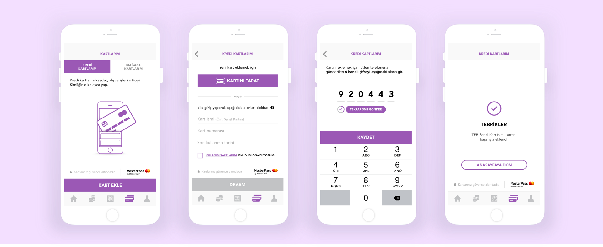
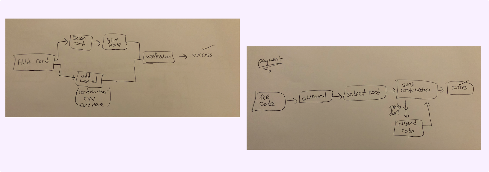
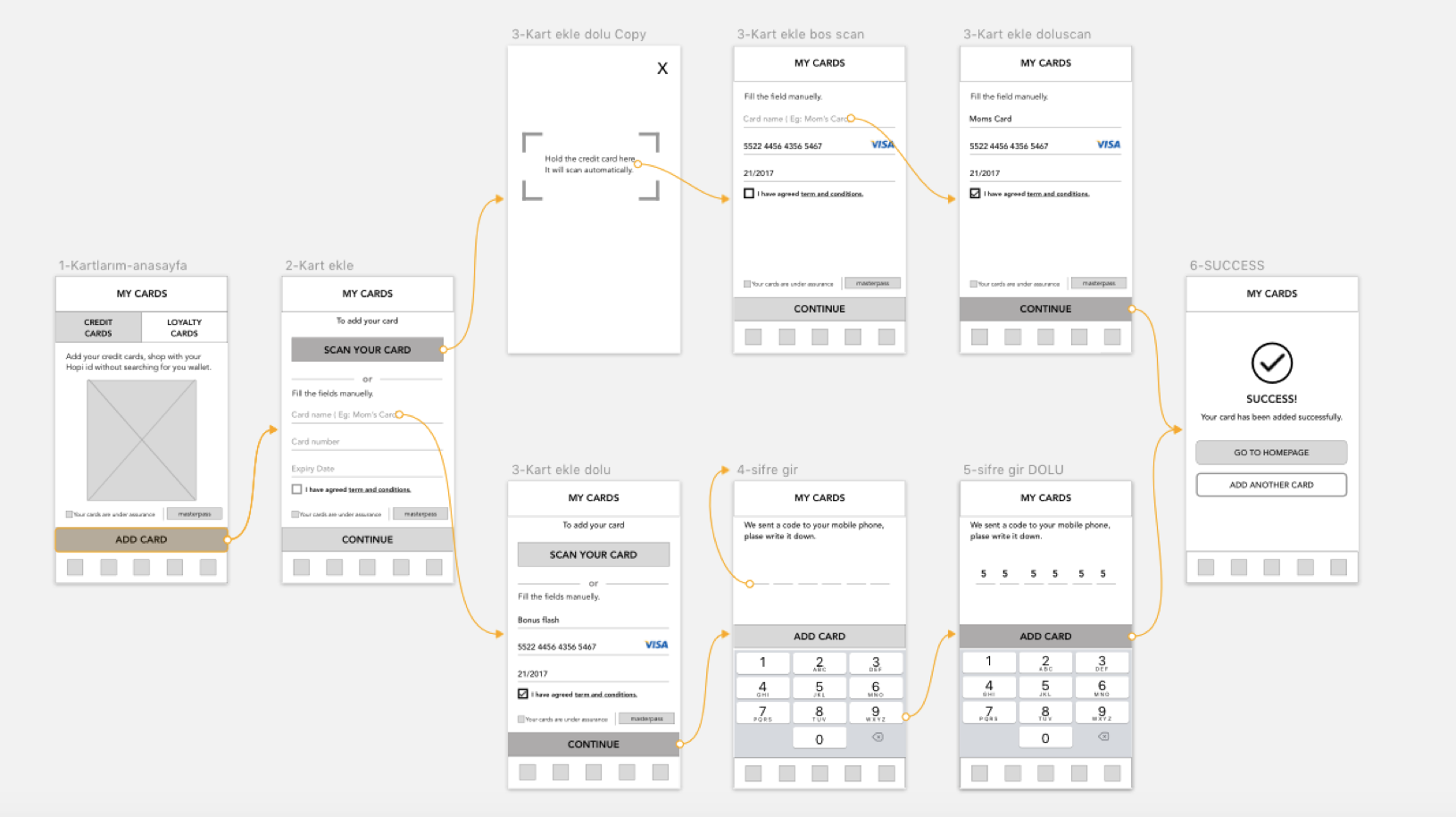
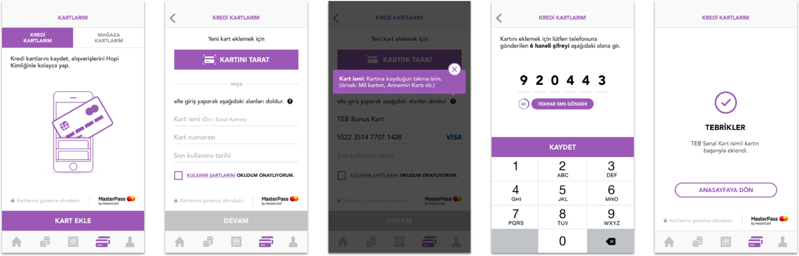
I started to work on making the process easy and simple for adding card and payment. For adding credit card, there were some required datas that the users have to fill, like card number and CVV. And also banks need to inform their customers by sending a verification code.
When I examined other apps I realized that apps are using card visuals, however card visual isn’t enough for people to recognize which card is which. So I’ve added another field for the required data “the card name”. Even if it seems more easy for users to recognize it, there was another problem; the difference between card name and the name on the card (users first and last name). To explain the difference I’ve added micro copy with an example and a tooltip.
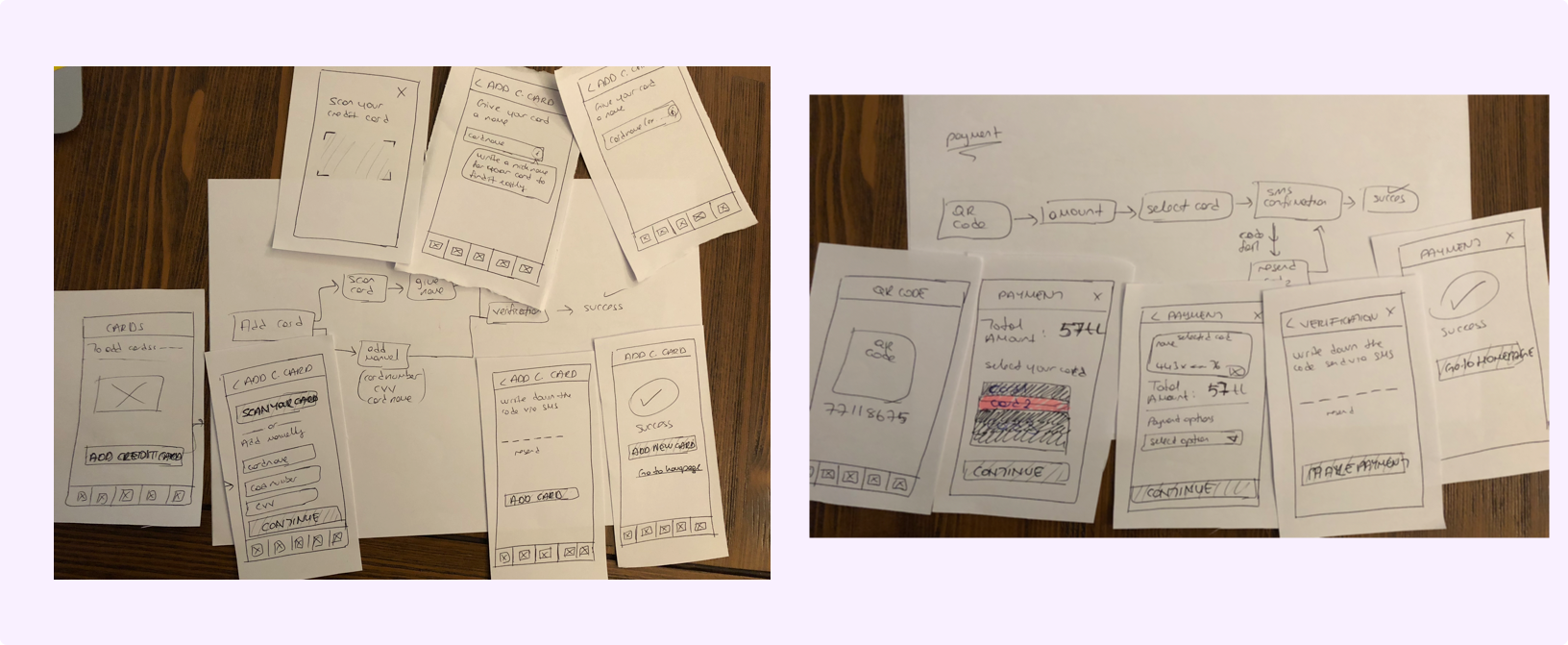
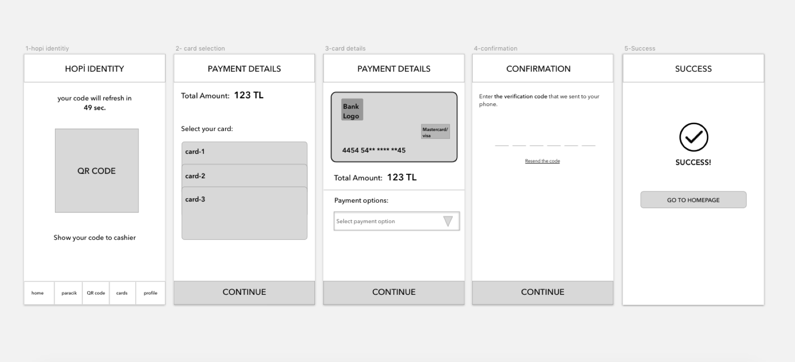
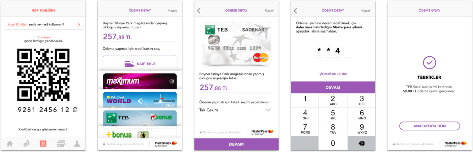
Payment process was more clear: the first thing that the user want to see was the amount that they are going to pay. Then they want to decide which card they want to use. When they choose the card, we directed them to the next level, the installment phase. After this step they proceed verification page which is again provided by bank.
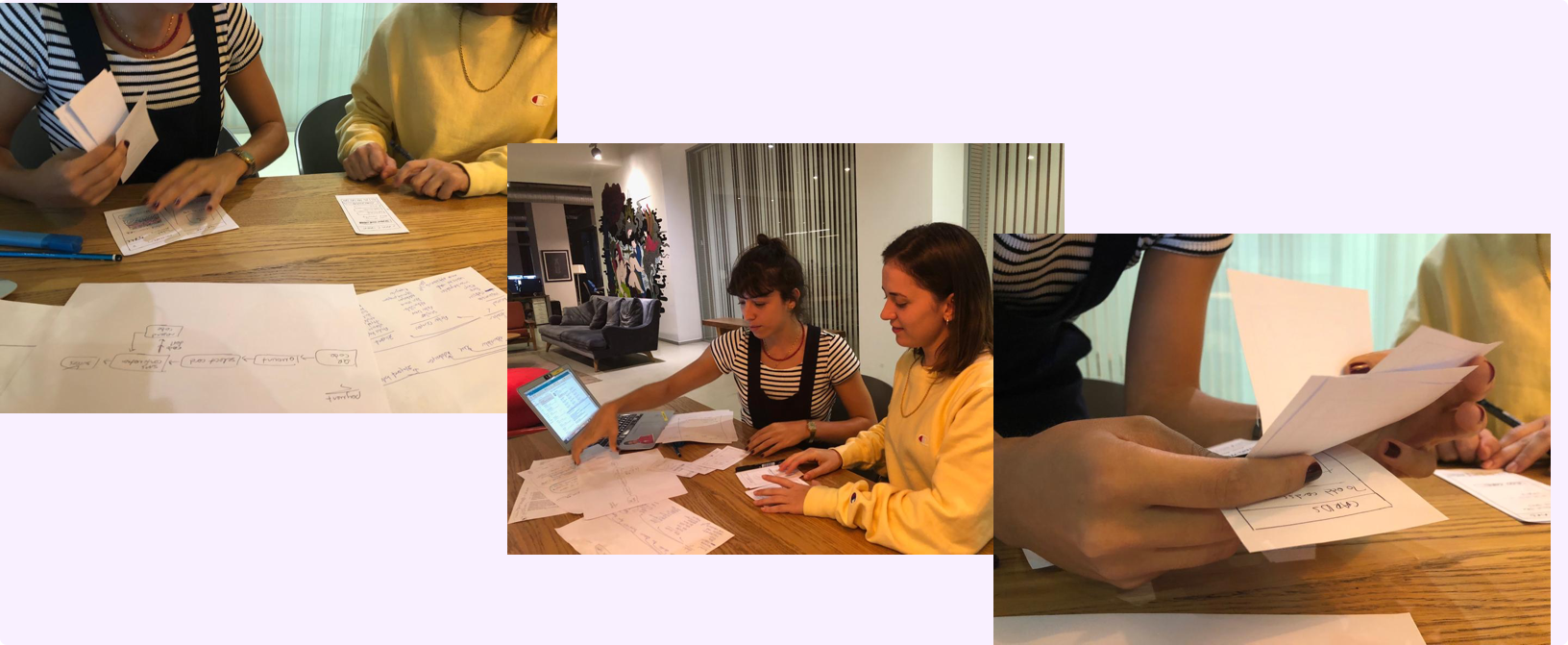
Before moving to the digital wireframes I’ve tested my sketches. Both flows are simple and users completed their tasks easily.
Vodafone - Digital Score Website Migros - App Redesign KoçSistem - Responsive Website
