
KoçSistem wanted to make a mobile application and website that would enable marketers and salesmen to find documents they were looking for at all times. When the salesmen are on the field, they would proceed by showing the relevant presentations to their customers. This project would benefit both KoçSistem employees and help Koç to undertake Digital Transformation.
I worked as an UX designer. My responsibilities in UX included; designing user flows, preparing wireframes, prototyping, user testing, incorporating user feedback into design iterations and leading design and development teams.
Our team consisted of 1 UI designer, 1 illustrator, 1 animator, 7+ developer (Mobile app & website), 2 analyst.
There were 3 different platforms that employees are already using. This one should be different and more easy to use than other ones.
I created 2 main personas for CustomerFFirst by talking with the client because only the people who work in KoçSistem will use this platform. And these people are salesmen and product owners. Both of them have different needs and I need to solve their problems.

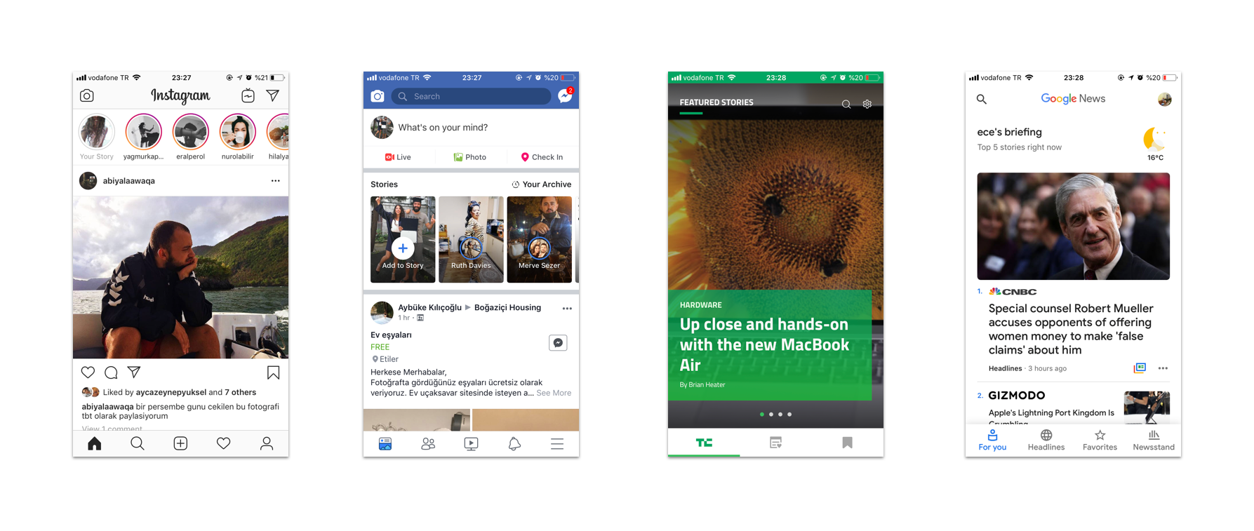
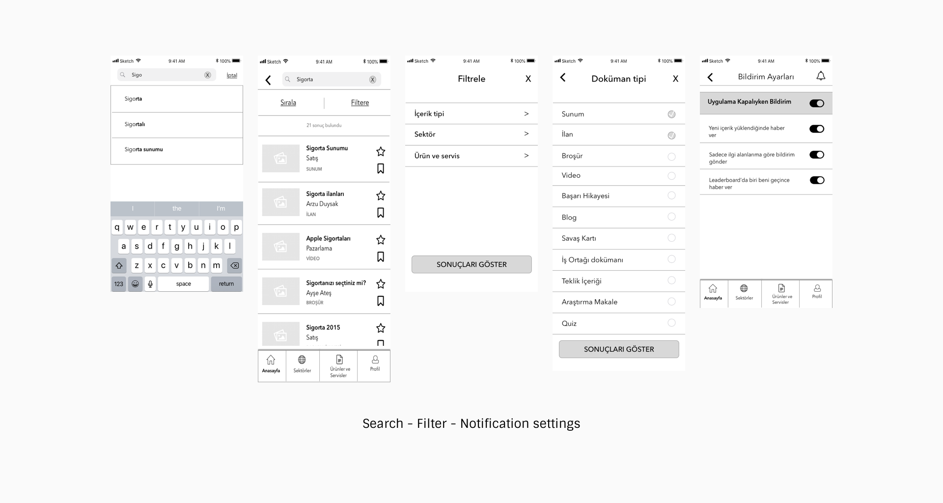
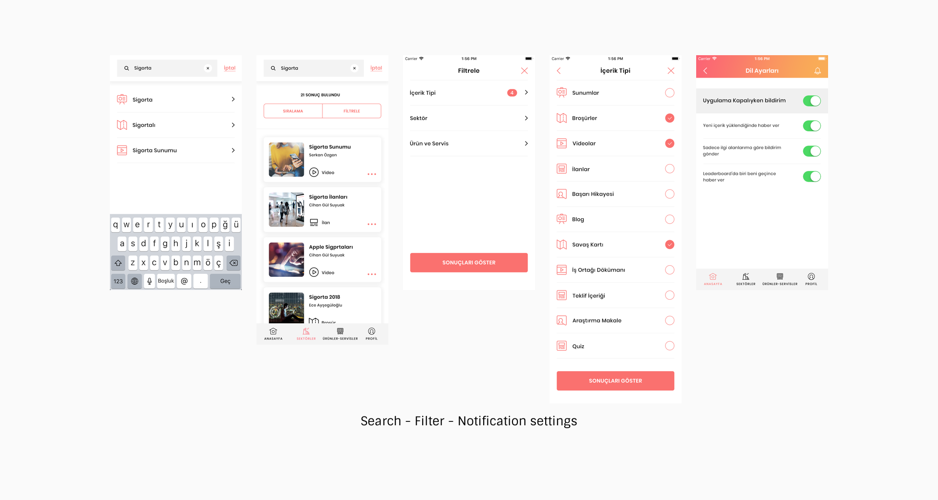
I started the project by getting the opinions of the users about the search and storage platforms they used before. In line with the comments, we decided to move forward with a structure that would make them more comfortable to use when using them. Instead of classical document search, file saving applications, I’ve started to take social media and news applications as examples because they are the most common ones that everyone uses. First, I examined the navigation structures of these applications. Some of them used only sub-navigation and some used sub-navigation and menu together according to content numbers. We decided to move along with sub navigation and menu because our content number is quite a lot.
 Navigation
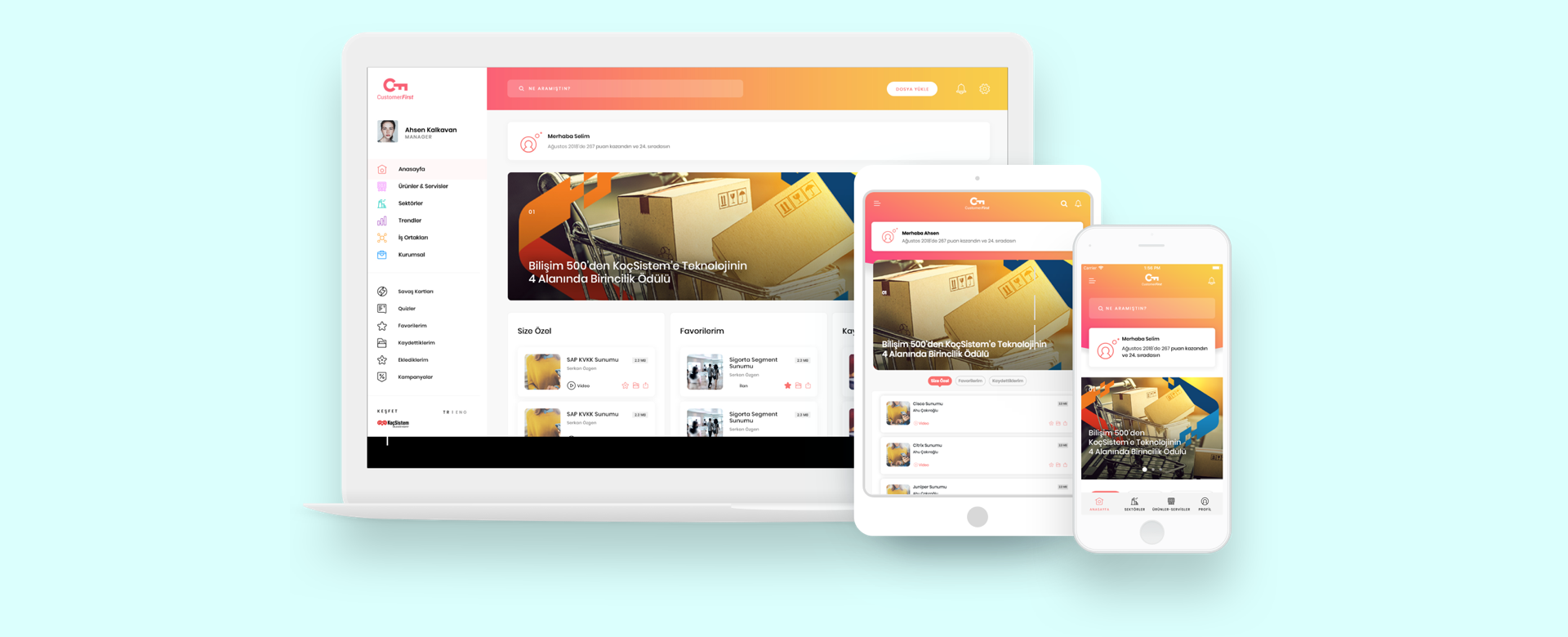
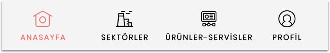
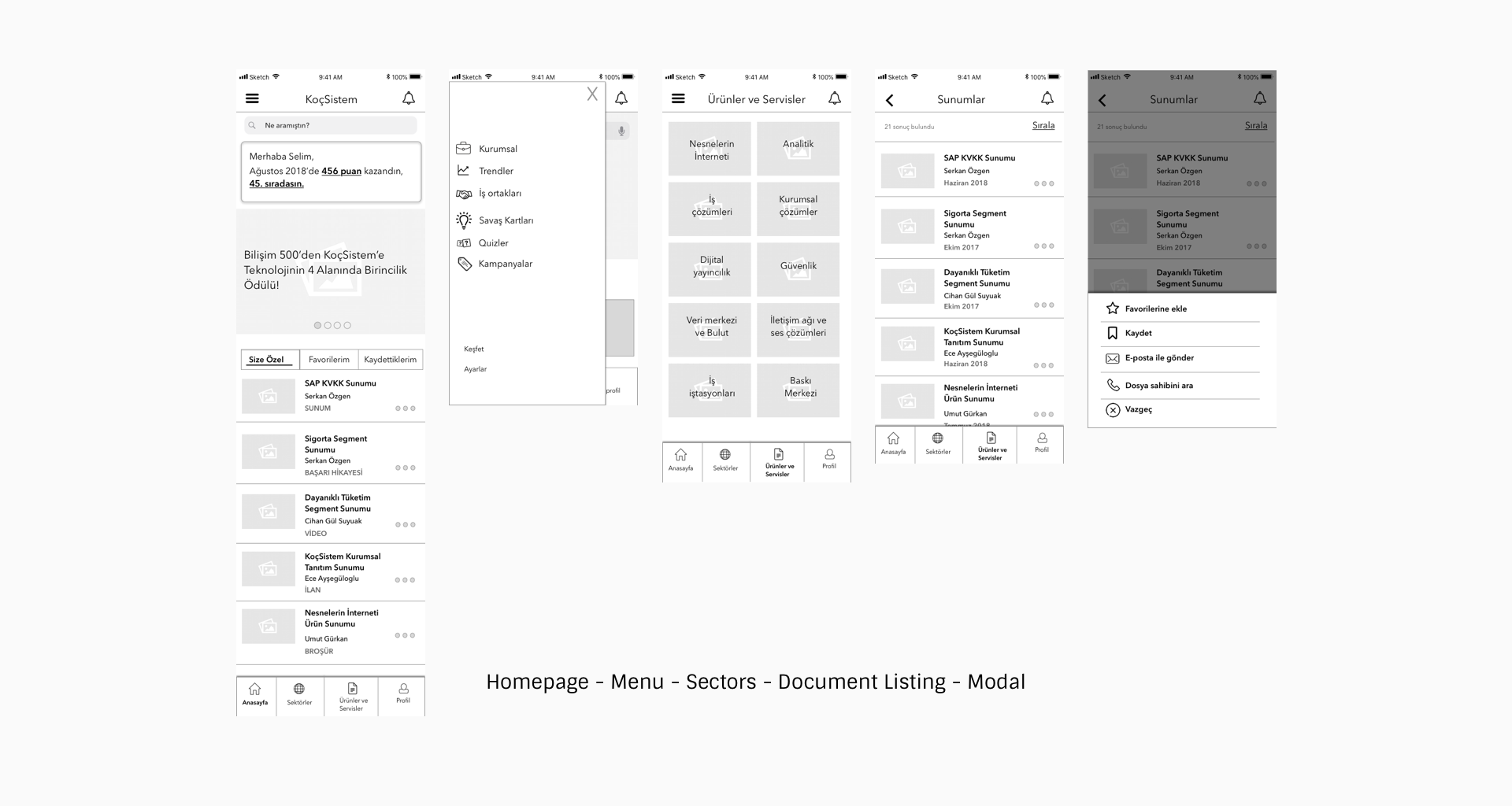
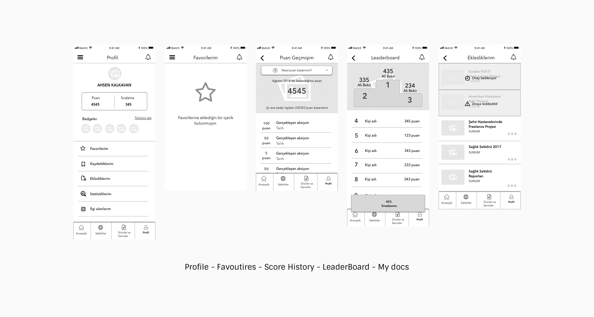
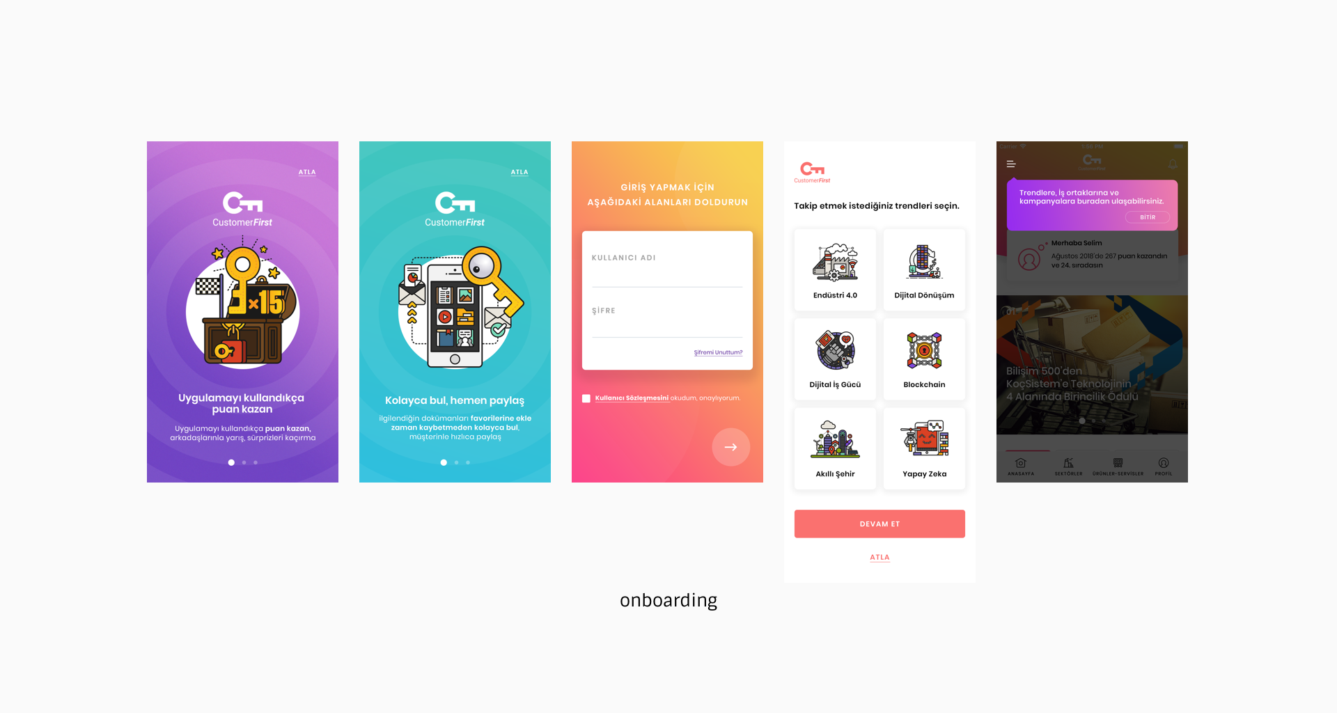
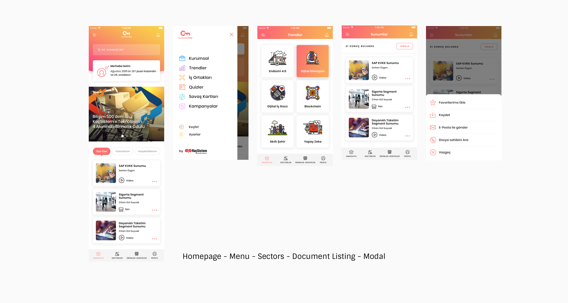
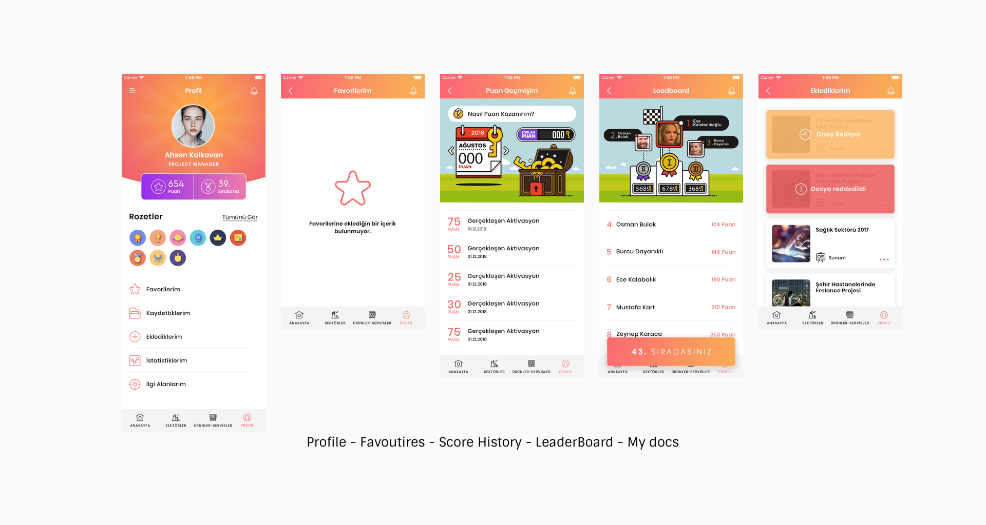
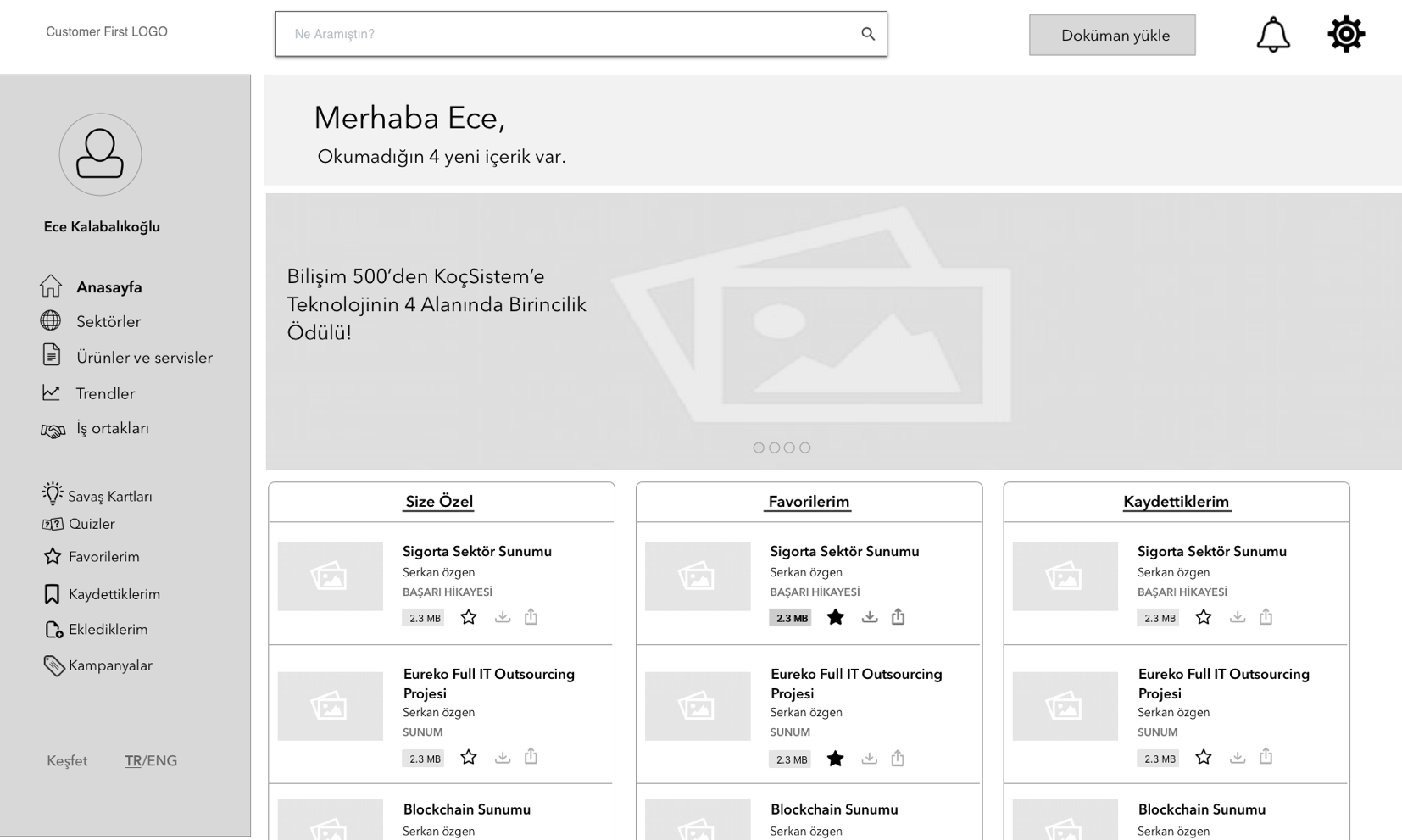
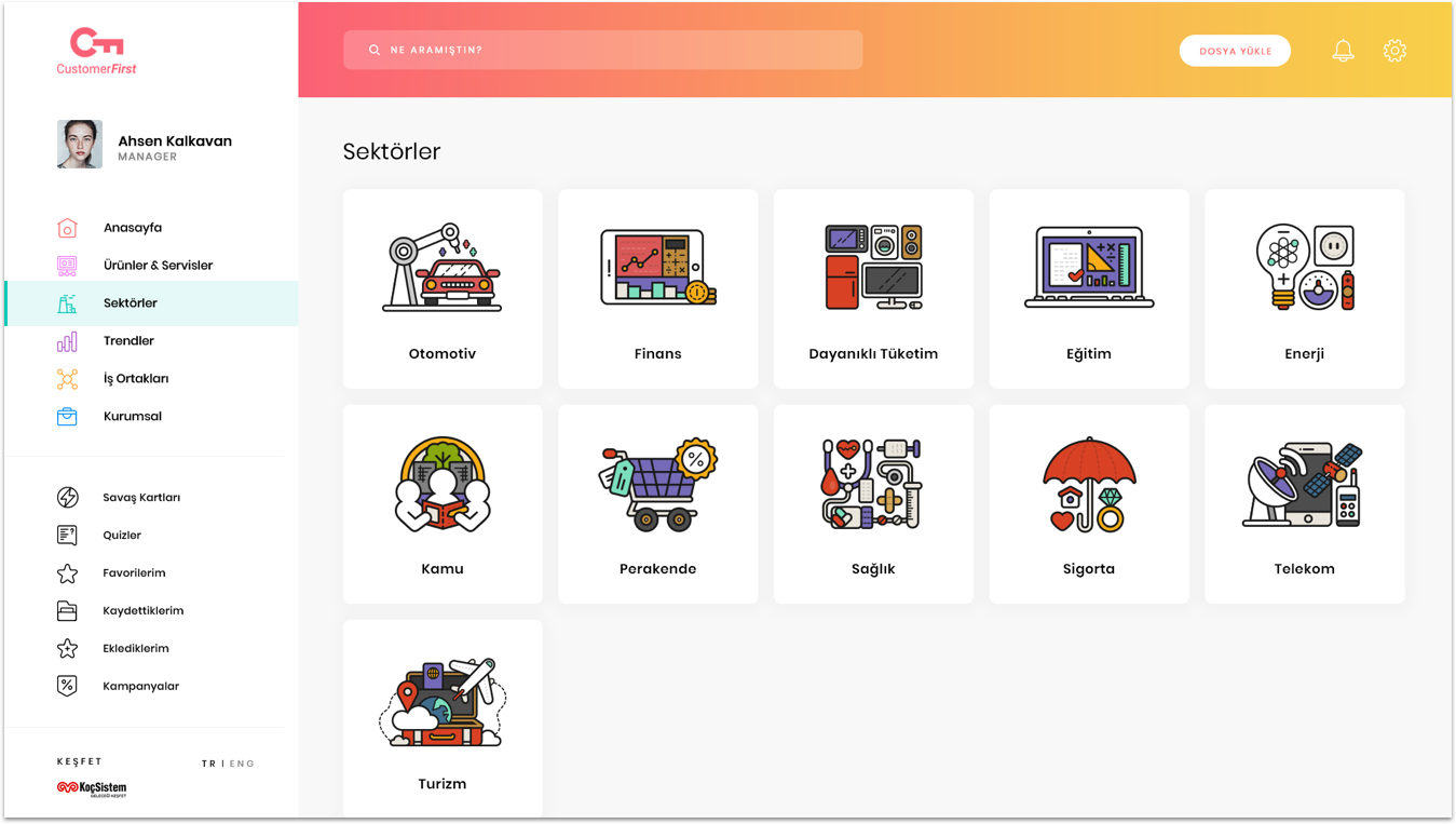
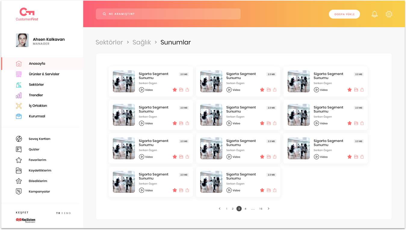
According to interviews and meetings withthe stakeholders, I started to built the information architecture. There are 2 main categories that users should access easyly: sector and product. So, in the main navigation, I placed Homepage, Sectors, Products and Profile. This type of documentation applications generally don’t give place for a profile, however we want to use it to make users more connected with the app. Also, there was a gamification part of the app which makes users interact with it.
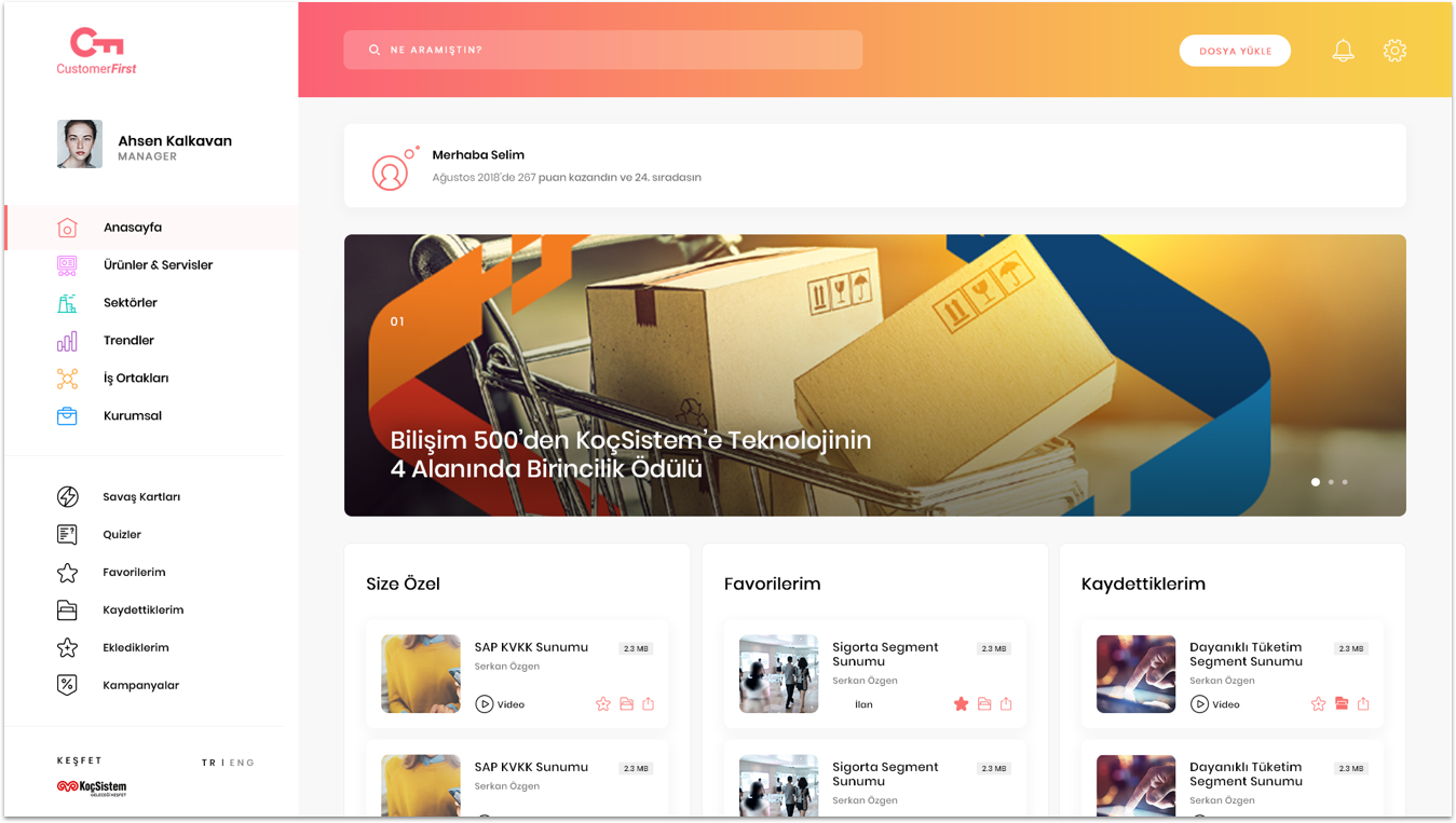
There were 3 types of documents that users want to see and shakeholders want the show on the home page; for you, my favorites and saved by me. As we take examples of social media apps, we thought that people are used to scrolling and designed the home page with this assumption. Testing is everything! Before moving on to digital wireframes, we tested our home page and we realized that users don’t want to scroll, they want to see everything at the first look.
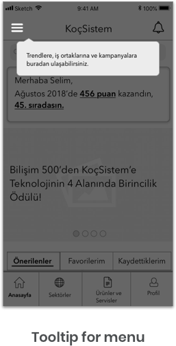
One of the tasks we gave in the usability testing was finding a title in the menu. Since they saw the subnavigation menu and they didn’t think of checking the hamburger menu. As a result I adeed a tooltip which explains what is in the menu. By adding the tooltip, users realize that there is another asset that they can check and they knew what is in it.
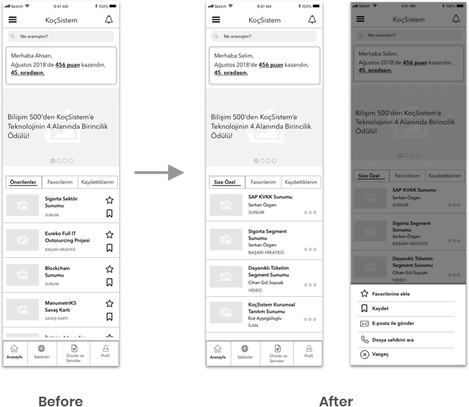
Another answer we heard a lot was, users generally don’t save or add their favorites a document without reading it. They didn’t care if these actions are easy to do or not. Since we changed the icon, we had a modal for 4 different actions: add my favorites, save, call the document owner and share this document

Desktop version was different than the app and mobile web version because there was some additional feature in desktop which is upload a file. Generally product manager will use this button in order to upload the most current versions about their product. That was the reason why we created the second persona. Upload process should be easy because if it isn’t easy than users won’t want to use it. To make it simple, we asked only one question in each step, which will help them follow the structure. When we finalized the wireframes we conducted another usability testing with different people and the result was really good. Everyone easily followed the steps and was able to upload the files.
 Click to see the prototype
Vodafone - Digital Score Website Hopi - Mobile Payment Migros - App Redesign
